Written by
Kai Xin Koh

Have you ever sat through a presentation where the data just looks so.. dull? Or overwhelming? Don’t worry, we can relate.
Don’t get us wrong. Data is wonderful, and plays a key role in our decision making – especially in business. But, it can get a little boring sometimes. Furthermore, we tend to tune out after 10 minutes of listening, where it becomes easier to focus on anything except the presentation.
So, now that you’re the one conducting a business presentation, why not avoid giving your audience the same misery you’ve experienced?
How do you turn raw data into a compelling visual story that persuades your audience in a presentation?
Effective data storytelling starts by choosing the right chart type for the relationship you’re showing: bar charts for comparison, line charts for trends, scatter plots for correlation. Lead with the key insight, not the raw data. Direct attention using a single accent colour on the most important data point. Add human context by explaining what the number means for a real person in the room. And always make chart labels large enough to read from the back row.
How can presenters transform dry data and statistics into a compelling narrative that audiences remember?
Data storytelling works when you follow a three-act structure: 1) Context — set up the problem or question the data answers, using a relatable scenario rather than starting with the numbers themselves; 2) The Reveal — present the key data point as the turning point in your story, using a clear visual like a before/after chart, a single bold number, or a trend line that tells the story at a glance; 3) The Meaning — explain why the data matters to the audience, connecting it to their goals, challenges, or decisions. Avoid showing full data tables in presentations — instead, show one chart per slide with a clear headline that states the insight, and reserve detailed tables for handouts or appendix slides.
Here’s the thing. As presenters, we often make the assumption that the more content crammed into slides the better. After all, more information does show that you’re more knowledgeable about what you’re sharing, right?
Not really.
In fact, when you first begin creating your presentation slides, one tip is to start by thinking of a headline that summarises your content succinctly. Think of it as a ‘Twitter-friendly headline’ as Carmine Gallo would say. This helps you focus on your key message so you can decide on which relevant information to include.
Data such as statistics and facts are fixed, but should not be rigid. If you have not decided on whether the information should be placed on your slides, ask yourself: What is your motive in presenting the data to the audience? If it’s just for the sake of showing, would it not be better placed in an appendix or word report?
The purpose of a presentation is to convince the audience to buy into what you’re selling, be it an idea, product or goal. That means it’s not just about using facts and figures – it’s also about appealing to their emotional side and gaining their trust. You need to craft a persuasive presentation
Here’s where data storytelling comes in.
The Art of Data Storytelling
“Numbers have an important story to tell. They rely on you to give them a clear and convincing voice.” –Stephen Few
Data storytelling is visualising data effectively. But despite so, it needs to be more than just creating visually appealing charts or graphs. It needs to be able to communicate the message across via the data presented. Basically, it all boils down to a combination of these three elements: data, visuals and storytelling.
When your story is coupled with data, it helps to explain to your audience what’s happening in the data and highlight the important points.
It helps enlighten the audience to insights that they wouldn’t see without charts or graphs. Visuals ensure that the data attracts the audience’s eyes to look at it – to be interested by it.
If you can combine these three elements together, you’ll definitely make your data come back to life.
Below is a video of Hans Rosling who is able to blend data and storytelling beautifully, so much that it can captivate anyone seeing him present:
Now you know how a good data storytelling is executed, learn how to prepare one as well. Here are our 3 proven tips that help boost your data storytelling:
1. Make It About Them
It is easy to talk about statistics. ’34% of children between the age of 7 to 9 in Singapore suffer from myopia’. ’13.3% of Singaporeans are smokers’. However, these are merely figures to the audience.
For example, if you’re sharing about myopia to a group of parents, ‘34%’ sounds rather insignificant, doesn’t it?
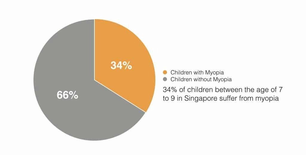
Here’s where the problem lies. The percentage of children suffering from myopia seems small, and using a pie chart gives the impression that the probability of it happening to their child is low. In the end, the figure you’ve shown is easily dismissed and forgotten.
Business presentations, especially those that you seek to convince with, are often filled with so much information that the audience becomes accustomed to it. Numbers lack the emotional impact that gets them to think, ‘okay, I need to pay attention because it concerns me’. So if you want to make an impression, you have to make it personal.
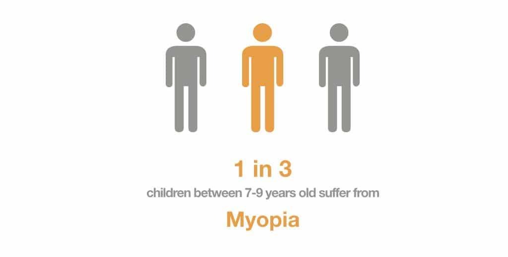
Start by amplifying the meaning behind your numbers. The beauty of data is that you can represent it in various ways to form different perspectives and opinions.
In this example, you can make it personal by asking the audience to look to their left and right. Tell them that amongst themselves and the two people beside them, one will have to tackle this problem with his or her child. Now the perspective has shifted. Instead of dismissing it as a low probability statistic, people now see themselves in the position, and they immediately realize the urgency to address the issue.
2. Get Your Audience to Fill Someone Else’s Shoes
“You never really understand a person until you consider things from his point of view, until you climb inside of his skin and walk around in it” – Harper Lee author of the book ‘To Kill a Mockingbird’,
In many situations, we frequently emphasise the need to empathise and presentations are no different.
Your audience is generally eager to see you succeed. Unfortunately, they have short attention spans and will eventually start to drift off. To make things interesting, and increase their understanding of what you’re saying, giving them the opportunity to see things from another perspective.
Example
Here’s the first example: Let’s say you’re delivering a sales presentation on HR software.
“After making the switch to our HR Software, 55% of these existing users have a 120% jump in productivity”
Sounds alright. You heard the benefits loud and clear. But… you don’t see the need to do anything about it right? There is no motivation to make you do so.
Now take a look at this example:
“John is a HR Manager who used Program X. He feels so frustrated with the system as it caused him problems with managing his staff, tabulating salaries, and other issues that added on to his workload rather than reducing it.
Then he made the swap to our HR system. Instantly, his burden was lightened.
Salaries became easier to calculate, employee holidays were easier to manage and John no longer has to worry about the system breaking down. 55% of other users like John found a 120% jump in productivity”
Do you feel inclined to do the same as John? That is the power of storytelling.
Its main goal is to get your audience to feel the pain of maintaining the status quo, and envision the positive results if they go with your suggestion. It makes the character relatable to them.
Makes the audience understand why the problem is a problem and how the solution can help them.
There are many storytelling techniques that help connect the audience to your message. ‘The Hero’s Journey Approach’ and ‘Mystery Storytelling’ are the most simple yet high effective techniques many speakers use to create an impactful presentation.
3. Simplify Not Intensify
Charts are fantastic, they demonstrate what we want to say without using dozens of words that clutter the slides. With a quick addition of a few bars and lines, we remove the need to explain the numbers individually.
But what happens when your charts get too complicated? You’re back to square one. Charts are intended to help the audience visualise data. But when ‘data-dumping’ occurs, your audience is once again faced with the task of digesting the information in the short span of time when you show the slide.
As we’ve said earlier, data is fixed but not rigid. You may not be able to change the figures, but you can change the way it is presented.
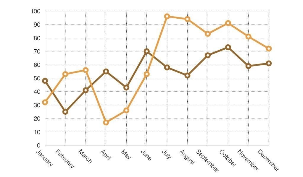
Let’s assume you’re sharing a comparison set of statistics between two companies.
Start by asking yourself, what is the intention of presenting these figures? Is it to show an increase or decrease on a certain month? Is it to show the difference?
Once you’ve figured out the purpose, remove all the unnecessary data. You can leave them in the appendix if needed, but since you’re not going to talk about it in your presentation, eliminate it.
The next step is to ask yourself what your audience requires to understand the chart. Are the guidelines needed? Do they serve a purpose, or will eliminating them make it look clearer? Is it necessary to label every single point on the axis?
Based on that, we can remove unnecessary lines and details, to keep the chart simple.
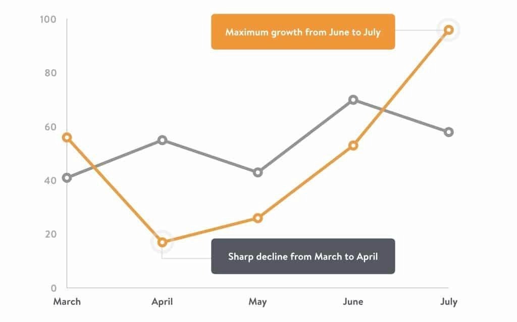
Once you’ve removed the lines, you can add labels to the key points that the audience should focus on.
Wrapping It Up
Remember, this isn’t school work, where the reader has to see every single step you are doing. These people whom you’re presenting to need the easiest way possible to understand what you are trying to say in the shortest amount of time.
Data is integral in showing why the audience should trust your presentation or you. The beauty of your data should be shown visually as well. Remember to keep these three tips in mind when working on your data, and have fun!
Article Written By: Kai Xin Koh
Co-founder and Head of training at HighSpark, Kai Xin’s super power is to empower high-performing individuals win more hearts and minds through persuasive communications. She was recently one of the only 20 Singaporeans to be honoured on the Forbes30Under30 Asia list. Beyond business, Kai Xin makes time for meditation, is determined to lead her life mindfully, and aspire to unveil the magic of the mind.
Frequently Asked Questions
What is the best chart type for showing a trend over time?
A simple line chart with no more than 3 data series. Avoid 3D effects, gridlines, and excessive axis labels. Label the key inflection point directly on the chart. Your headline should state the insight, not the chart type: “Revenue doubled after the pricing change” not “Revenue over time.”
How much data should you put on one slide?
One insight per slide. If you have five insights, you need five slides. Each slide should contain exactly one chart or visual, one headline (the insight), and one sentence of supporting context below. Everything else goes in the appendix.
How do you make numerical data relatable to a non-technical audience?
Use analogies and comparisons. Instead of “13 petabytes of data,” say “enough data to fill 17 million filing cabinets.” Instead of percentages, use “1 in 4 customers” or “roughly the population of Australia.” Convert abstract numbers into tangible concepts your audience already understands.


Ready to put this into practice?
HighSpark's training programmes, trusted by 15,000+ professionals.
Explore Training